You’ve created your participatory science project and participants are reporting data on CitSci. Awesome! Now, how do you make sense of all that data?
You might start by looking at it on a map (a geospatial analysis) to look for patterns, gaps, and other clues about what is happening. With CitSci, project managers and participants can explore data spatially, in real time.
In this article, you’ll learn what’s possible with CitSci maps and get ideas about how to gain real-time insights regarding your work.
New to participatory science? Get started with CitSci today.
- Intro to CitSci Maps
- Where to find the Maps
- Map on Project Home Page
- Map Page
- Understanding the Legend
- Who can view the Maps
- Visual Accessibility
- Additional Layers
Intro to CitSci Maps
What you’ll learn in this article:
- Where to find the project maps
- How to read the map legend (including basemaps, icons, colors and symbols)
- The differences between categorical and numerical variables
- How legend categories are calculated for categorical and numerical variables
- How privacy settings at the Project, Datasheet, and Question level determine what maps can be viewed and explored
- About visual accessibility features of CitSci maps
- How to enhance your dataset with your own spatial data layers
Where to find the Maps
There are two places you can explore project maps on CitSci:
(Examples from Utah Water Watch)
Map on Project Home Page
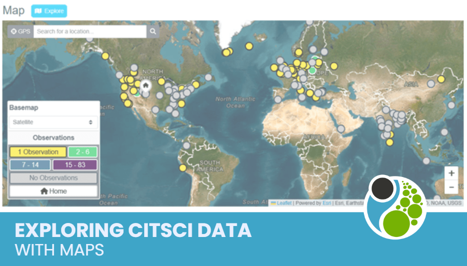
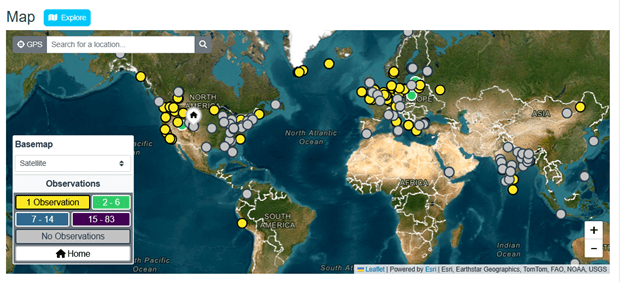
The project home page shows a basic map for the project, zoomed out to view all project observations at once. When discussing CitSci maps, we’ll refer to the observation locations as map markers. The map markers are color-coded and symbolized by counts of the number of observations made at different locations. If a project has a lot of observations, they are represented as colored circles with no symbols when zoomed out (coarse resolutions). As you zoom in (fine resolutions), the circles switch to map markers with symbols inside them.
Map of observations for NASA’s Space Cloud Watch project zoomed out showing only colored circles because of the large number of project observations.
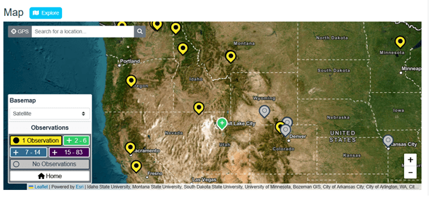
As you zoom in, you start to see symbols in addition to the colors to indicate the range of numbers of observations represented by the map markers. Pairing symbols and colors in the map markers helps people who see colors differently be able to see differences between the markers more easily. They also help when printing CitSci maps in black and white.
Map Marker Colors and Symbols
Yellow map markers nearly always represent locations with one observation. As you zoom in on the map, the yellow map markers will have a solid black circle inside them indicating 1 observation has been made at this location. Green, blue and purple map markers (with + symbols in them when zoomed in) represent 2 or more observations with different ranges depending on the total number of observations for that dataset. Gray map markers (with open circles inside them when zoomed in) represent locations that have been created but do not yet have observations associated with them. These symbols are most common in projects where managers have created pre-defined locations or where observations may have been deleted from a location.
Zoomed in map of observations from NASA’s Space Cloud Watch project with map markers representing the number of observations with colors and symbols. You can easily notice that the location in Utah has had more observations (2-6) than the other locations shown.
No Observations
Sometimes you will see grey dots or grey markers with open circles on the map associated with the legend item that says “No observations”. These map markers may represent locations that have been added to a project by a project manager that do not have any observations associated with them yet. They may also represent locations where an observation was deleted by a manager or the person who created the observation.
Explore
There is a blue Explore button next to Map on the project home page. The Explore button takes you to the Map page (a more detailed map; also linked under the project’s Data Tab). This map page allows you to explore project data even further (see the Map – Data Tab section below for more details).
Screenshot showing the blue Explore button next to the Map.
Map Page
When you navigate to the Map page available through the Data Tab, you gain access to more tools for exploring project data. You can:
- Look at the four basemaps (Satellite, Terrain, Street, Community)
- View number of observations
- View observations by datasheet
- Explore observations by different questions from each datasheet (numerical or categorical)
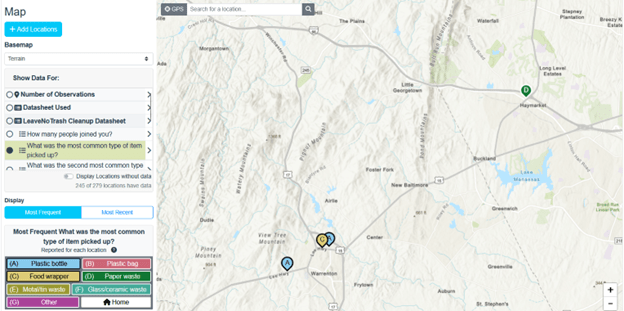
In this example, let’s say we’re looking at data from the Leave No Trash project led by Leave No Trace. You can select the LeaveNoTrash Cleanup datasheet from the legend and then further select which datasheet question you’d like to explore. Here we selected the LeaveNoTrash Cleanup Datasheet and the question, “What was the most common type of item you picked up?”
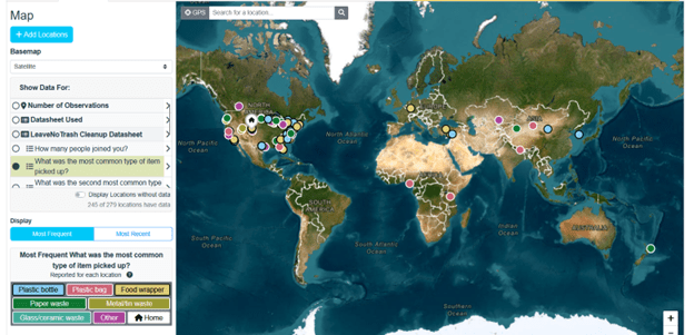
The Leave No Trash map page showing display of the most common type of item picked up. Each observation location shows a colored map marker that corresponds to each distinct category of item picked up (plastic bottle, plastic bag, food wrapper, paper waste etc.)
Understanding the Legend
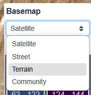
Basemaps
CitSci maps are created using ESRI Leaflet. You can choose from four different basemaps: Satellite, Street, Terrain, and Community.
Satellite
Shows a satellite image of the earth, showing vegetation, roads, dry areas, water and other landscape features.
A map with the Satellite basemap turned on.
Street
Shows the roads, streets, and building outlines, with symbology and colors depicting vegetation, water, and other natural features.
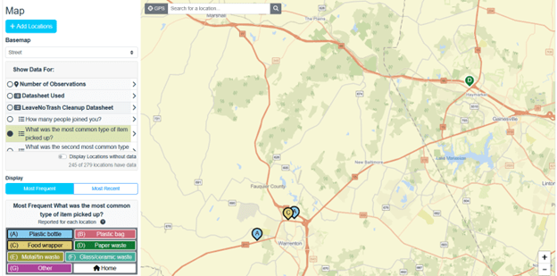
A map with the Street basemap turned on.
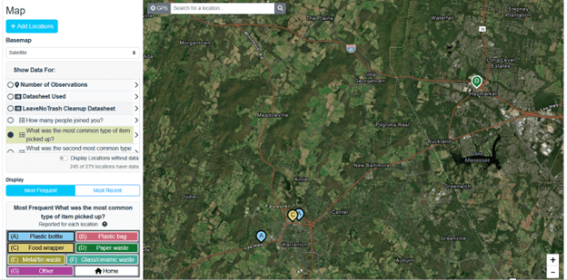
Terrain
Shows the topography of the earth, including elevation measurements, overlaid on a street view style map.
A map with the Topography basemap turned on.
Community
Shows a street view style map and may include additional labeled features contributed by members of the ESRI community.
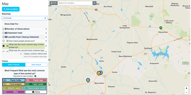
A map with the Community basemap turned on.
Legend Icons
You may see up to four different icons in the legend, depending on the dataset being displayed on the map. Let’s explore what each of the icons means.

Categorical variable – a variable that is divided into discrete groups that don’t necessarily have a particular order to them. Examples include yes/no, color categories, weather categories, and more.

Datasheet Used

Map Marker – Denotes number of observations

Numerical variable – a variable represented by numbers (can be discrete or continuous). Examples include pH (discrete) and temperature (continuous).
Categorical Variables
Map from Trout Unlimited’s Trout in the Classroom project showing the categorical variable “Tank clarity” with options for Clear, Slight haze, and Cloudy. In this map, most tanks have clear water and only one tank has slightly hazy water – good news for the new trout being raised in these tanks for eventual release into the wild!
When you select a categorical variable in the legend, the bottom of the legend will show “Display” and a toggle between “Most Frequent” and “Most Recent”. You can click between these two choices to see the map symbols for that categorical variable displayed by most frequent or by most recent for each of the variable conditions. Each category in the legend is displayed with a distinct color. In the example below, you can look at a question about weather conditions and see the map that shows the most frequently reported weather conditions for each location or by the most recent weather conditions for each location.
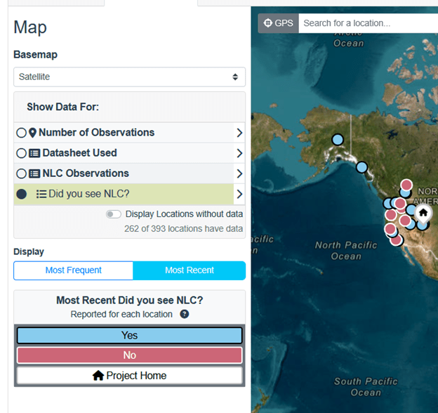
Categorical variables can be viewed by counts of Most Frequent or Most Recent observations, like in this example from NASA’s Space Cloud Watch project.
Numerical Variables
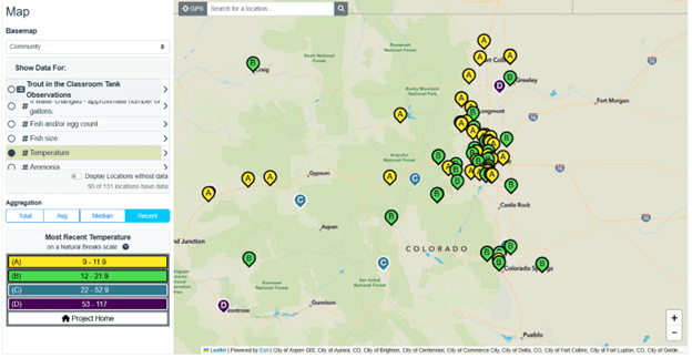
Map of Trout Unlimited’s Trout in the Classroom project showing the numerical variable Temperature.
When you select a numerical variable in the legend, the bottom of the legend will show “Aggregation” and a toggle between “Total”, “Average”, “Median” and “Most Recent”. You can toggle between these choices to see the map symbols for a numerical variable displayed by each of these conditions. In the example below, you can look at a question about water temperature and see the map that shows the median water temperature at each location or the average or most recent or total. Average water temperature may be useful if you are monitoring locations over time.
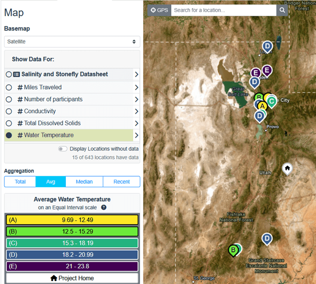
A map of average water temperature, a numerical variable, from the Utah Water Watch project.
Pro Tip: While all map displays are available for all projects, not all map displays will make sense for every variable. For example, if you are viewing the variable “Water temperature”, looking at a map of “Total” water temperature for a particular location over time may not make much sense. Instead, you may choose to view “Average” or “Most Recent” water temperature. The “Total” (option might be very useful, however, for viewing a variable like “Miles traveled”.
As you work with your team and community, it is important to talk through the different map combinations together and discuss which map viewing options make the most sense for each variable you are studying and why. These maps create many opportunities to teach critical thinking skills about understanding maps and data.
How CitSci calculates legend categories
We use best mapping practices to create legends that work across projects and variable types and adjust automatically as new data are reported to your project. If you’d like to know more about these techniques, we’ve included links to the textbook Geospatial Analysis 7th Edition, 2025 – de Smith, Goodchild, Longley et al. You can also reach out to us through CitSci Help.
Numerical Variable Calculations
- Total: Calculated using Natural Breaks (Aka Jenks Natural Breaks). The numeric input is summed together for every observation at this location automatically. The numeric outputs are separated into categories based on natural separation of values within the underlying data.
- Average: Calculated using Equal Interval. The numeric input is the mean value reported at this location. The legend breaks up the outputs into categories so that the number of observations in each category is (approximately) the same. Since the number of observations continuously changes, they will rarely be exactly equal.
- Median: Calculated using Equal Count. The numeric input is the median value reported at this location. This is separated into categories with approximately equal numbers of locations.
- Recent: Calculated using Natural Breaks (Aka Jenks Natural Breaks). The numeric input is the most recent value reported at each location. The numeric outputs are separated into categories based on natural separation of values within the underlying data.
Categorical Variable Calculations
- Most Frequent: The most frequently reported value for each location is displayed. The coloring scheme and any alphabet labels (A,B,C…) are generated automatically.
- Most Recent: The most recently reported value for each location is displayed. The coloring scheme and any alphabet labels (A,B,C…) are generated automatically.
Who can view the Maps
CitSci projects can be set up with a variety of privacy settings, from project to question level. Project privacy choices influence what data (and therefore maps and map markers) you, your participants, and the public can see. Read our “Setting Up Your First Project & Datasheet” blog for a deep dive into privacy settings.
Here’s the short version:
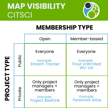
Chart showing the visibility of maps based on project privacy and membership settings, with examples that link to each type.
If a project is Public, with Open membership, everyone can see the maps and the map markers on the maps (see below for nuances with private datasheets and private questions).
Example: Stream Tracker
If a project is Public and Member-based, everyone can see the maps and the map markers on the maps (see below for nuances with private datasheets and private questions).
Example: Trout Unlimited WV-VA Water Quality Monitoring Project
For both of these scenarios, when anyone clicks on a map marker, they can see the data associated with the marker (again, see below for nuances with private datasheets and private questions).
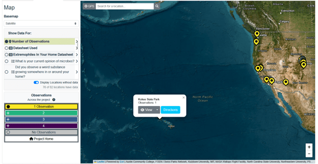
This map marker in Hawaii from the Extremophile Campaign: In Your Home led by the Two Frontiers Project shows us a gray View button. When you select the View button it will open the observation location page where you can opt to view additional data about the observation.
If a project is Private, with Open membership, only project managers and members can see the maps and the map markers on the maps (see below for nuances with private datasheets and private questions).
Example: Project ReefLink
If a project is Private and Member-based, only project managers and members can see the maps and the map markers on the maps (see below for nuances with private datasheets and private questions).
Example: Perennial Atlas
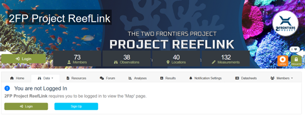
When I try to navigate to Project ReefLink led by the Two Frontiers Project, I receive a message letting me know I cannot view the map until I am logged in. I would also need to be a member of this project to see the map.
These settings also apply in varying ways to private datasheets and private questions on datasheets.
Private Datasheets
If a project is Public and either Open or Member-based, everyone can see the maps and the map markers on the maps for the public datasheets. Map markers will appear for private datasheets, however only the person who submitted the observation and their manager will be able to see the data they entered for that datasheet.
For example, in the image below from a demonstration project (Public, member-based), non-members of the project can see map markers for the blue Private datasheet ( in this case, the markers have an A on them). When they click on the map marker, they can see that this datasheet, named “Private Datasheet” was used and there was 1 observation.
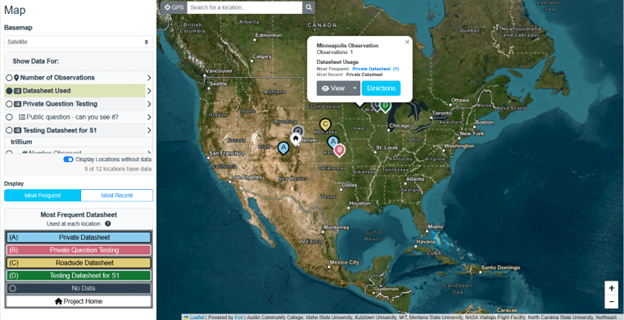
Demonstration project map of a private datasheet map marker (in blue, labeled with an “A”)
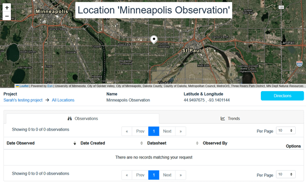
When someone clicks on the gray View button for that observation, they are taken to the map marker location, where the location name is visible but no other data can be viewed, as demonstrated in the Location screen below.
Private Questions on Public Datasheets
Some public datasheets include the occasional private question. For example, a project manager may ask “Do you enjoy participating in this project?” to collect qualitative data about participant experiences. They may want to make that question private so participants feel comfortable stating their opinions.
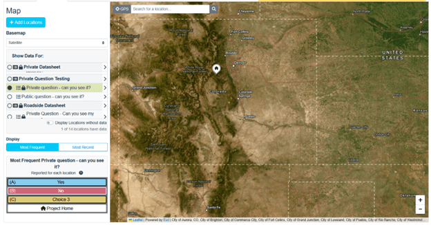
Private questions are treated in the same way as private datasheets. If a project is Public and either Open or Member-based, everyone can see the maps and the map markers on the maps for the public datasheets. In the example below, there is a datasheet called “Private Question Testing” that has two questions, one is a public question and one is a private question. For demo purposes, we’re labeling these questions “Private question – can you see it?” and “Public question – can you see it?”
When you select the datasheet itself, you see all the map markers for the observations submitted to the datasheet.
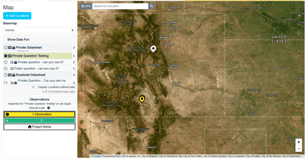
Demonstration project map showing a public datasheet called “Private Question Testing” that shows the locations of observations (in yellow with a black dot) made with that datasheet.
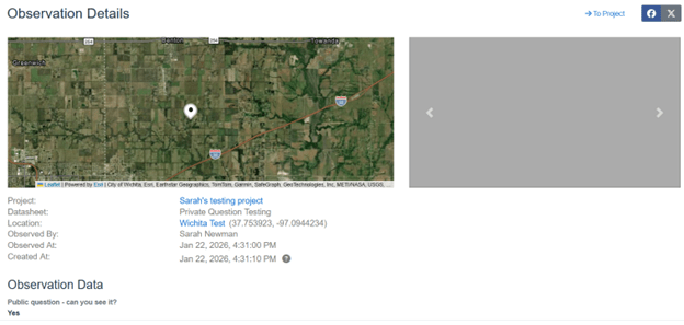
If you click on the map marker and it happened to have an answer for the Private Question, you won’t see any data for it. In the example below, I know that I answered the private question and the public question for this particular location. If I log out of my account and try to view the observation as a general user, when I click on it and follow it through to see the data, I can only see the answer to the public question.
When we select the “Private question – can you see it?”, the markers where that question was answered disappear.
Visual Accessibility
Humans see colors in very different ways. Some of us see a full rainbow, some of us don’t see color at all, and many of us fall somewhere in between. We intentionally designed the CitSci map legend with visual accessibility in mind. Some users will see the full color of the legend options, others will see it in shades of gray or with just the symbols within the map markers to differentiate observations. We hope that the majority of people who view these maps will benefit from this accessible design to see and explore project data.
Additional Layers
Project managers can link to additional geospatial data layers that are publicly available as hosted Web Feature Layers (WFS) on platforms like ESRI ArcGIS Online.
To add additional layers to maps on the project home page and the more advanced map page:
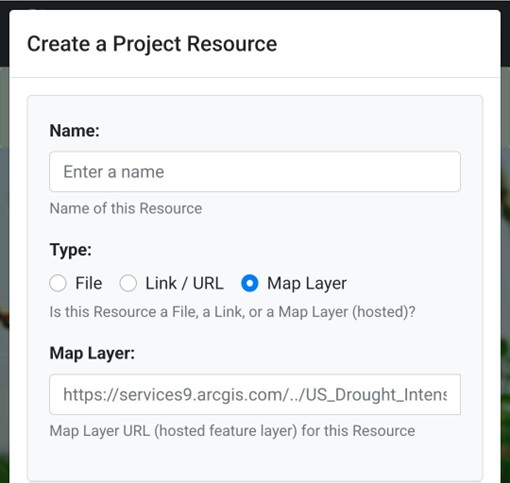
- Navigate to the Resource page of your CitSci project.
- Add your layer as a resource.
- Select the type of resource to add (File, Link / URL, Map Layer).
- Select map and copy and paste the URL of your publicly available WFS layer.
Try it!
Add the US Drought layer to your project with the by adding the URL below as a Map Layer:
Pro Tip: Project managers can add their own layers by uploading them from ArcPro desktop software to ArcGIS Online. When doing so, you often need to add “/0” at the end of the URL provided on ArcGIS Online to indicate the first layer found at the URL you provided. The drought example above actually provides many layers at the url and the “/3” at the end instructs the server hosting the data to display the fourth (0 is the first or default, so it goes 0, 1, 2, 3 etc.) in a collection of layers.
Below is a screen shot of the dialog for add project resources showing Map Layer selected as the resource type.
Once added as a Resource, your new layer will appear for all project members (and the general public if your privacy setting is set to Public).
Please note that the colors provided in the hosted Web Feature Layers you add as Resources will be the colors seen by those who toggle on the layer on your maps. All map layers you add are toggled off by default, so please let your members know that they can toggle them on to further explore project observations alongside the other spatial data (maps) you have provided for them.
