
You’re inspired to start an influential project, you designed it, implemented the plan, and then measurements start coming in. You stare at a table overflowing with rows and columns of values. What’s next? Data analysis is the vital link between obtaining measurements and actually understanding them and communicating results.
Using CitSci.org’s features, you have the capability to view your data over time with basic summary statistics, view and download scatterplots comparing different variables, and export your data to multiple file types.
Working with measurements- types of data
Your project is likely to have two different types of data- qualitative and quantitative. Qualitative data are concepts and aspects of your research that can be described using words, not numbers. On the other hand, quantitative data (think quantity) are numerical values. For example, in the Cambridge Urban Tree Monitoring Project, qualitative data would be something like “Tree Condition: Excellent”, while a piece of quantitative data would be “Tree Circumference: 18.8496 inches.”
When it comes to summary statistics and graphs, quantitative data is what you’ll be working with. Being able to apply basic mathematical concepts and statistics to your research enables you to discover trends and patterns, in turn allowing you to interpret them and determine their importance. Basic summary statistics, such as mean, minimum, maximum, standard deviation, and number of samples are a great place to start. These simple numbers can be used in further computations exploration of cause and effect relationships. One extremely helpful way to interpret measurements is by visualizing them. CitSci.org’s software includes maps, bar charts, scatterplots, and more.
Data visualization- maps
Maps are a great way to represent spatial relationships, for example population density, occurrence of wildfires, bird sighting locations, or simply display the location of your project. The map below shows where Southwest Exotic Mapping Program (SWEMP) has gotten observations from. CitSci.org’s mapping tool is interactive, so you can search for certain sites or locations.

Figure 1: Map of locations where observations have been taken for the Southwest Exotic Mapping Program (SWEMP). Grey pin is the Project Headquarters, and orange circles show where many observations have been taken.
Data visualization- bar charts
Bar charts are a helpful tool to compare data that is divided into categories. In the Analyses- Trends tab of a project’s page on CitSci.org you can easily view summary statistics and a bar chart for measurements of your choice. The bar chart below from Utah Water Watch displays Air Temperature measurements. The X-axis represents a range of temperatures, and the Y-axis represents how many times (frequency) that each temperature range was observed.
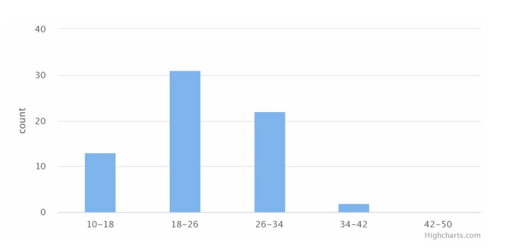
Figure 2: Bar chart of Utah Water Watch’s Air Temperature data in degrees Celsius.
Data visualization- line graphs
The same measurements can be displayed similarly using a line graph. This type of graph is especially useful to visualize changes over time. The figure below displays the same air temperature data as the previous bar chart, but in a different way.
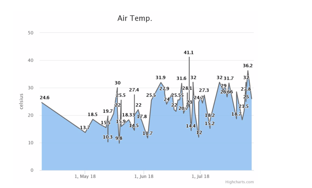
Figure 3: Time series of Utah Water Watch’s Air Temperature data in degrees Celsius for the year 2018.
Data visualization- scatterplots and correlation
Moving beyond representation of categories and time series, scatterplots are a way to view relationships between variables. It’s likely that your project’s hypothesis attempts to explain the cause for a certain phenomena. A scatterplot can give you an idea of how connected two variables are- to what extent that one variable impacts the other. This is also known as correlation, or the association, the degree to which two variables are related. This relationship can be expressed even further by creating a linear equation as a numerical description.
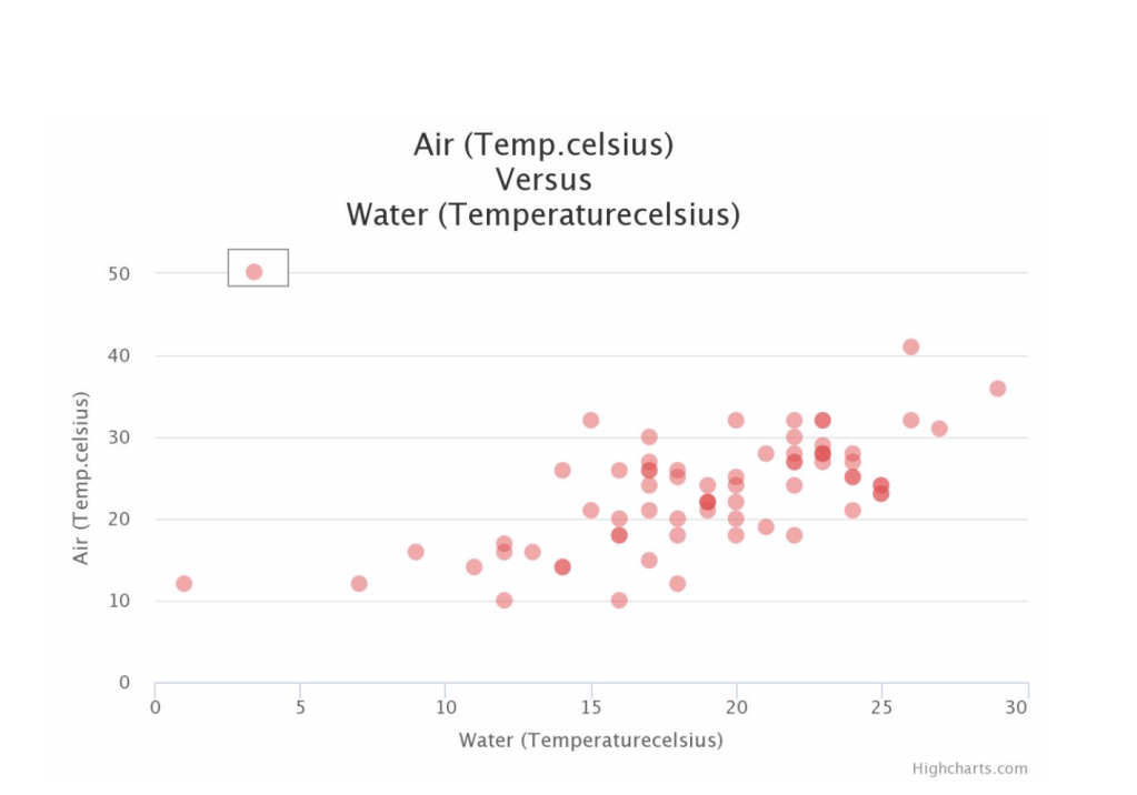
Figure 4: Scatterplot of Utah Water Watch’s Air Temperature and Water Temperature data in degrees Celsius for the year 2018.
Special tools on CitSci.org
Navigating to a project’s homepage on CitSci.org and the Analyses- Relationships tab, you are able to choose any two variables and graph them. To use Utah Water Watch as an example again, the scatterplot below includes Water Temperature values on the X-axis and Air Temperature on the Y-axis. Just at first glance, you get an idea of how Air and Water Temperature are correlated.
The last function in the Analyses tab is comparisons. This is another way to visualize data, this time comparing mean values. Choose any measurement that is available for the project and the locations you want to compare. The example below from Trout Unlimited Coldwater Conservation Corps Water Quality Monitoring compares Stream Stage values for 5 of 103 locations. The output is a bar chart including error bars.
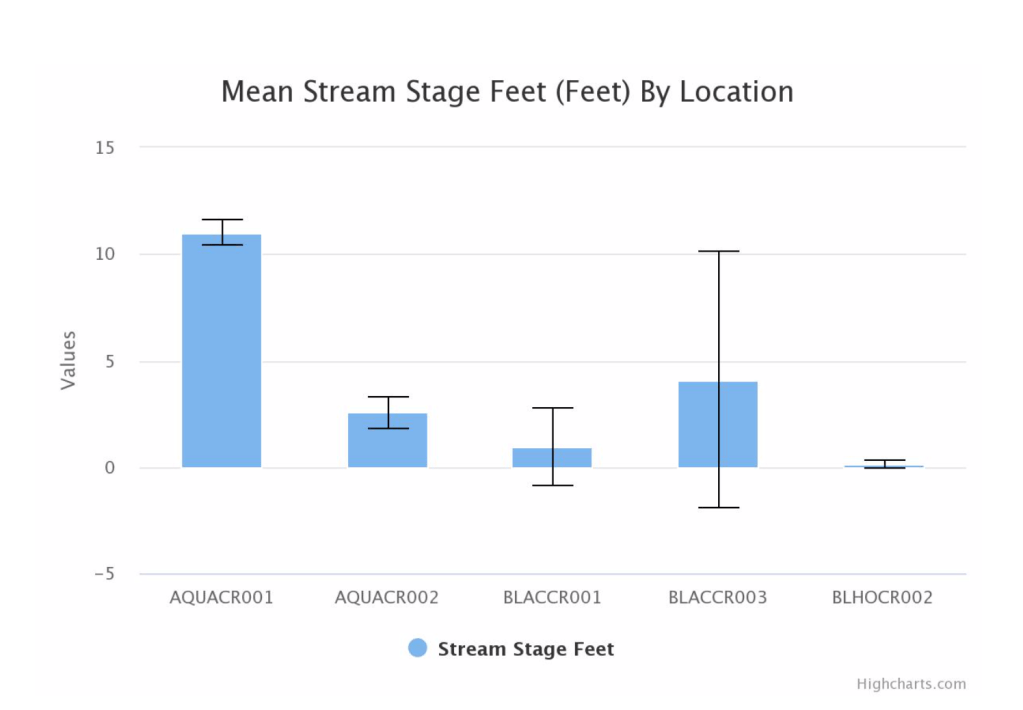
Figure 5: Bar chart comparing Trout Unlimited Coldwater Conservation Corps Stream Stage values for 5 locations.
Power to the people
Now that you have summary statistics and various visual representations of your data, there is so much more power in your hands. These tools can be used for your own interpretation and understanding and also a means to communicate your results. If your project is ongoing, starting to analyze data as you go might give more insights, and sharing these is also a great way to keep your volunteers engaged. If your project is completed, basic statistics and graphs will be integral to solidify your conclusions and inform future research. The tools on CitSci.org are a diving board to delve deeper into what your data is telling you. So next time you find yourself staring at a spreadsheet full of measurements, take the steps to employ the power of data analysis.
Cover photo: Getty Images

2 comments on “How to Transform Data to Communicable Results”